
- Illustrated Poetry
- Lunacy
- Comments
All Comments on 'Lunacy'
by minsue
- 20 Comments
YES, YES, YES!
everything fits, so well.
Sends a shiver, with the thought of receiving this
as a card - A hallmark from hell
I loved the words, and I loved the image. The font was a bit hard on the eyes, though. ~Imp
I have no idea what brought this on, but I loved it.
"Tidal torments . . ." Superb line.
mismused
Your Poem was mentioned on the thread
'New Poems Reviews'
thanks for the journey~
This is an example of 40 words being worth a picture.
A nice poem here that applies to most of us.
It is a good poem to illustration, but I would like it even better if you would reconsider the dark fancy lettering because it really is very hard to see such a good poem in all that darkness.
Dark and foreboding, just loved it. You deserved and "E" for this poem...a mini-masterpiece!
Sack
I liked this style. It made me think of someone typing this poem, throwing it out and someone else finding it...the way the paper was marked, reminded me of crinkled lines..
I loved this ~ "enthralled by the weight of your words" ~
Very nice!!
~Honey
alliterations. Gravitas was predictable and stuffy. Lunar lunatic was overkill. But good idea and colors. Still, I prefer Molten and especially Shadowlands.
nice to see that you have expressed something with such great meaning in a different way!
Winemaster
I loved the whole atmosphere of the poem. The darkness and the acceptance worked well. And then there's the helplessness. I wonder if the poem speaks in the same way to everybody.
And beautiful picture.
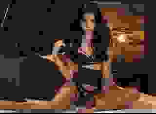
Dark passions at play here are so well illustrated by this foreboding black Photo. The blue moon sets the mood for this dark and passionate piece.